Celebrity Face Development (11.28.11)
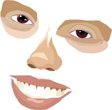
To demonstrate our understanding of Adobe Illustrator we decided to recreate a celebrity face using a template to guide us. The celebrity I was given was Jessica Alba. Though it is still in the beginning stages, I have mostly completed the eyes, nose, and mouth. I am mainly focusing on the layers tool to create basic shapes and arrange them in front and in back of other shapes to create the different shades and contours of Jessica Alba's face. Check in in the next few days to see another development, and then the finished piece!
Celebrity Face Development (12.2.11)
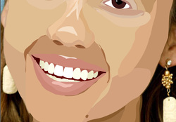
In this development I have most of the skin, eyes, nose, and mouth finished. I still have the template picture on so it appears that I have the ears and earrings done, even though I do not. The face was one of the hardest parts to do because of all the shadowing and large pieces of one color. It was difficult to find a balance that makes it look realistic, but also artistic.
Celebrity Face Project (Finished 12.12.11)
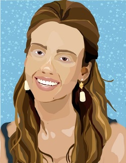
Our celebrity face project was one of the longest and most difficult projects we have done so far. It required a lot of time and patience. We had to create a digital version of the celebrity we were assigned (I got Jessica Alba) using a temp;ate and Adobe Illustrator. We were able to use many different tools on Adobe Illustrator, but the main ones that we used were the pencil tool, the selection tool, the fill tool, the ink dropper tool, the symbol sprayer tool, and the layers tool. I finished the project with 11 layers: Eyes, Nose, Mouth, Face, Neck, Ears, Earrings, Hair, Shirt, Template, and Background. I made each piece of her by basically taking the pencil tool and outlining a basic shape of the section on the template I was working on and filling it with the appropriate color. It is a puzzle of very small pieces put together to make one big picture. The most difficult part of this project was the shading on the face and hair and deciding just how many colors you should use. You want the picture to still look like the celebrity you were assigned and be recognizable, but you also want it to have some cartoon qualities.
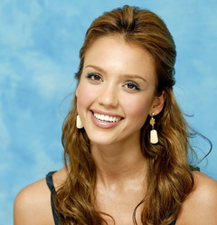
The original picture of Jessica Alba.
Self Portrait

Our next class project was to make a self portrait using the same process as our celebrity face project. To do this we took pictures of ourselves and saved them in photoshop. We downsized the pictures so that they would be easier to work with and we put them into an indexed color file and narrowed down the number of colors in the photo. I decided on 12 colors in mine. I then saved the picture, opened in it Illustrator, and began to recreate my face using the same technique that I did on Jessica Alba. I used the pencil tool to draw around the colors and used layers to keep everything organized and give it a 3D effect. This project was very similar to the Celebrity Face project, but it was simplified and took on a more cartoon-ish appearance. I am very happy with the outcome.
Adobe Illustrator Shell
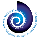
To make this shell with words I used the the symbol tool and selected the shell shape for the basic shape. Then I used the gradient tool to make the colors fade from black to purple to blue. I then used the path type tool to type the words from inside the Adobe Illustrator cs idea kit. Finally I just adjusted the text so that it started and ended where I wanted it and colored the words not in the shell turquoise and the words in the shell white so that they would stand out against their background.
Picasso's bull (Logo Development)
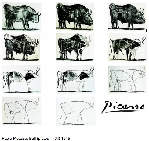
To prepare for our next project we took time in class to observe and discuss how the artist Pablo Picasso made his bull. He started off with a really complex, realistic bull picture and then as time went on he slowly changed its shape and then began to narrow down it's features and make it more stick-figure-like. We want to use the same technique to create and simplify a logo in class. Focusing on the basic shapes will keep us from getting to realistic, and will help us make a easy, recognizable logo that could be used for any product.
Purple Hopper Productions logo
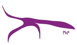
In class we researched many different companies logos. We researched how they were created, what the meaning behind it was, and how the logo changed throughout the years. Next, we were given a logo for "Purple Hopper Productions." It originally started as a picture of a grasshopper, and was put into illustrator and simplified to make an easy logo. We had to take the already very simplified image of the grasshopper and make it even simpler. We had to make it into an easily identifiable logo. I took the few basic lines of the simplified grasshopper and connected them, turning it into one smooth line creating the basic shape of a grasshopper. This project was difficult because you need to find the balance between simplified, and too simple.
Wine Tasting Poster
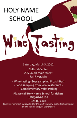
Our next class project was to make a flyer for a Wine Tasting benefit being held to raise money for the Holy Name School. I made this flyer by using adobe illustrator to draw a wine bottle and the words "wine tasting" in font that looks like wine. I made a stream of wine coming out of the top of the bottle and used the fill tool to make it appear as though the flyer was half full. For the finishing touches I added wine corks as the dot to any i's and added the text given to us by Mrs.Nassif. I really like the outcome of my poster and even though it didn't win I am proud of what I made.
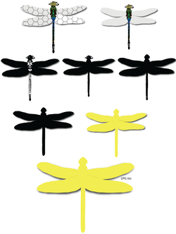
Dragonfly Logo Development
Our next assignment was to develop a logo for a fake company according to the story that Mr.Adam's gave us:
My name is Leonard Pinth Garnell III. I grew up I the rich farm country of Wisconsin about 30 miles west of the town of Upper Pringley. As a young man I was fascinated by flying creatures and the mechanisms that allowed them to stay aloft and change directions so easily. While attending college I met my wife Prunella and dropped out shortly after our relationship began. I felt I needed to prove myself as a husband and begin to earn money. Children and the drudgery of work pointed me in the direction of entrepreneurship. I knew that I would never be happy working for someone else and I felt that inventions were my way to the top of the mountain. I worked like a dog trying to come up with anything that I thought people needed. I invented a new sled which I named after my favorite dog ‘rosebud’. I constructed a front-end dampening device for a Ford Mustang which I called the ‘Johnson rod’. Although some of these inventions sold modestly, none brought me the recognition that I wanted. One day I was watching an airplane make a slow lazy turn at the end of a corn field while spaying poison for the yellow corn beetle worm fungus. I wondered why the plane couldn’t make a tighter more efficient turn. Then it hit me, think like a bug! A flying bug!
Based on the story, I decided to pick a flying insect, a dragonfly and used Adobe Illustrator to recreate a picture of a dragonfly that I found online. Then I began to simplify it to make it look more like a normal logo. First, I got rid of the pattern in the wings. Next I made it all black and white. Then I made it all black. After that, I began to take out small details like the antena and other things that do not change the basic look of the dragon fly and smoothed out any rugged lines. Then, I made the dragonfly yellow like the yellow corn beetle and added the company name in small, simple text.
