Magazine Add
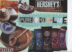
For our first project in graphics class we did an add for a product created entirely out of magazine clippings. I used the explosion technique to make the words "Pure Chocolate" stand out and placed many pictures of chocolate and items with chocolate in them around the edges. I used unity with my colors and used the explosion technique using crayons.
Yard Sale Flyer
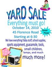
For our second project in graphics class we did a windshield flyer. The event I chose to advertise was a yard sale. I used different pictures from clip art and many styles and fonts of text to help emphasize my event title. I included the date, the time, the adress, and more details about the product to give the people reading it a sense of what its about. In my original flyer on Microsoft Publisher, it has a fading white to purple background but it would not upload correctly on weebly.
Magazine Portrait
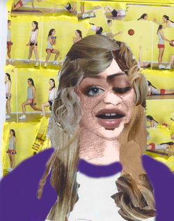
Our third project in graphics class was to create an abstract portrait of ourselves using a picture of us, photoshop, and magazine clippings. We took a photo of ourselves, made them black and white, drew lines on the most important features of our face, and copied it a bunch of times until it faded lighter and lighter and began to look like a drawing. We then took clippings from magazines of eyes, mouths, noses, hair and other things and glued them onto the portrait. Next, we scanned them into the computer and used photoshop to recolor and add any additional details. This is my final product.
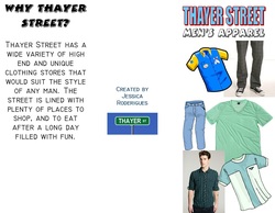
Thayer Street Brochure
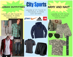
Our Fourth project for graphics was to research and do a brochure about shops on Thayer Street. First we went on a field trip to Providence to visit and walk around Thayer Street. We were each assigned a type of shop to visit and since my group got men's apparel we walked up and down the street looking for stores that sold this and went inside to gather information about each store. After we filled out a worksheet with the correct information we went back to school and started to work on a brochure in Graphics class. We picked a few shops to represent and decorated and added the information needed. My final result came out pretty good. The bottom picture had a colored background fading from white to blue back to white but it did not upload correctly on weebly.com.
CD Cover
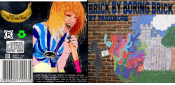
Our fifth assignment in Graphics was to reasearch and make our own CD cover. We were allowed to pick a song of our choice (as long as it was school appropriate), look up the lyrics, and base the design off of that. The song i chose was Brick By Boring Brick by Paramore. I began to brainstorm and form an idea of what I wanted the cover and such to look like, and after I had a clear picture in my head of what I wanted to do, i began to draw a picture. I drew the piece on the front cover of a silhouette of a girl throwing paint onto a wall. I drew this because it goes from being boring, to being in an exciting fairytale world. Next, I took a found a picture on the internet of the lead singer of Paramore, Hayley Williams, and I edited it in the paint program to make it look like a cartoon. I then added backgrounds to the CD's, made a record label, and added the barcode, compact disc, terms and conditions, and whatever else was needed to make it look like a realistic CD. I am happy with my outcome. The only thing i would change would be that I would make my drawing the same proportions as the CD cover so it could cover the entire thing so I wouldn't need to fill up empty space with the title, and i could put the title elsewhere.
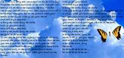
Inside the CD Pamphlet
