9/11 Memorial Pancake Flyer


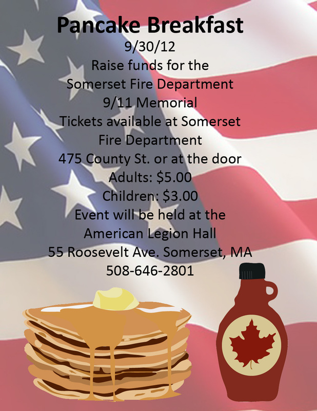
For our first Graphics 3 project of the year we made a flyer for the Somerset Fire Department Pancake Breakfast to help fund raise for the 9/11 Memorial. I used Adobe Illustrator to make a hand drawn version of the pancakes and my own syrup bottle and used a picture of a flag on low opacity to make a patriotic background for the flyer. I wanted to change the font of the title "Pancake Breakfast" to something more interesting but when I took the file home and converted it to Adobe Photoshop CS2 on my home computer it wouldn't allow me to change the text formatting. Also, when converted the plate under the pancakes somehow was lost so it looks like the pancakes are just floating which was not part of the original plan. Even with the mistakes made and issues that occurred I am overall pretty happy with how the flyer came out given the amount of time we had.
Britney Spears goes to the zoo
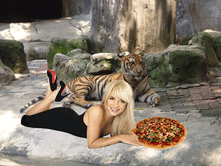
For this quick lesson we used the free transform tool to make the pizza appear to be lying on the ground of the zoo with our girl Britney Spears. We also reviewed how to clear out the background of a picture with the magic wand tool.
Engineering Technology Department Logo


Our second major project in Graphics 3 was to make a logo for the engineering technology Department. This department of the school includes Engineering Technology, Robotics Engineering, Graphics Engineering, Computer Diagnostics and repair, Computer Drafting and Design, Web Page Design, and Media Production. When creating the original hand drawn sketch we (Morgan Steele and I) tried to represent every class in the department with items that represent it. After making the basic sketch we scanned the drawing into the computer and opened it in Abobe Illustrator. We chose Adobe Illustrator because it is a vector based program, unlike Adobe Photoshop, so when the logo was finished being made, the school could enlarge or shrink it depending on their needs and have no pixelation occur. For this design we used mostly the shape and pen tool to create each of the objects. I created the 3D effects on parts of the logo by using the 3D object tool (piece of wood) and also by using a slight variation of colors to show depth and separation of pieces without using an outline (computer monitor bottom.) I'm overall very happy with how the logo came out. The only thing I would have changed would be to add a plastic wrap effect to the circular saw blade which gives it a shiny, metal-like appearence. I could not use this effect because it is a Photoshop Effect rather than an Illustrator Effect which causes the saw blade to be extremely pixelized when the filter is added.
Science Department Logo


For my next project in Graphics 3 I was asked to design a logo for one of the departments in the school. The department I chose was the Science Department. I started off this logo by brainstorming things to represent each type of science that we offer at our school. (Physics, Biology, and Chemistry) I then drew up a basic sketch that I can base my design off of and scanned it into the computer. Next using tools like the
