Amnesty International Poster

For my first project of term 3 Mrs.Schmigle asked me to create a notice for the Amnesty International club.
Symbol
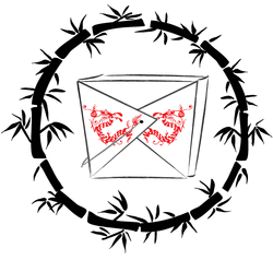
For our second project of term 3 we had to make a logo. The logo could be for anything we wanted, as long as it was not a remake of an already existing product logo and it was kept vauge. The topic I chose was chinese food. I started off my logo by sketching a few pictures of what the ideas I had. I decided to go with a simple chinese takeout box. I used the pen and shape building tools to create the bamboo pattern around the take out container. I also used the bloat tool to bend the bamboo to the shape I wanted. Additionally, I used the effects tools to get the look that I wanted on the bamboo to make it look more hand drawn, changed the brush strokes on the take out box to create the look of an ink drawn chinese painting, and downloaded fonts to get the dragon symbol used on the box. Most of the other tools I used were used to alter the image slightly. I tried to use colors that are typically used for chinese resturaunts: black, white, and red. I also chose to use red because it is proven that the color red makes people hungry. Overall, I am very happy with my logo. I think it clearly represents chinese food and that it could be used effectively.
Black and White Ticket
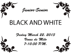
My next project in Graphics III was to create a ticket design for the Junior-Senior Black and White dance. The goal of this project was to make a simple, easy to read ticket. I first had to figure out a good size for a ticket. I decided to make 12 tickets per page. I next found a simple black brush border from brusheezy.com and used that to make the basic design of the ticket. Next, I chose a font that would be easy to read, but would also be asthetically pleasing and used that to write down the information needed. I put the finishing touches on the tickets and then printed 450 tickets on cardstock paper and cut them out by hand since the industrial paper cutter was down. I'm happy with the design because it stayed extremely simplistic like Ms.Pimento wanted, but also had an elegant touch perfect for a formal dance.
Prom Reserved Signs
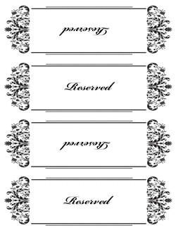
My next assignment in Graphics III was to create the reserved signs for prom as requested by Mrs.Pimento. I figured out the measurments of the reserved signs so that 2 of the signs would fit on each sheet of cardstock. After I figured out the measurments I picked out a design. I went with a simple black and white border to match the theme of old hollywood glamour. Once I found the border I wanted I put resized it and placed it in the correct section of the paper using the guide lines. I typed up all of the names of the staff chaperoning the the dance and then reflected them accross the horizontal axis to make it readable from both sides when the sign is folded. I also made signs that said "reserved". Overall, I am happy with how they came out despite the short amount of time and the need for a simplistic design.
Music Department Logo


