Lesson One
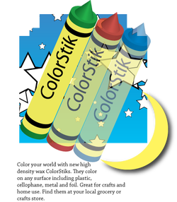
In lesson one we used the Adobe Illustrator instruction handbook to create a fake logo for ColorStik Crayons. In this lesson we learned how to go into the AICIB folder on our computers and open the different starting steps to each project. We also learned to use the symbol, symbol sprayer, sizer, shifter, rectangle, gradient, and many more tools in Illustrator. We also learned to use the align tool. These are all essential tools needed to master Illustrator and we will use them all for our projects further into the year.
Lesson Two
In lesson two we continued to use the tools we learned in lesson one and focused on working with the selection, direct selection, and grouping tools. These may seem like very basic tools but without them we would not be able to complete many complex designs we have planned for the future.
Lesson Three
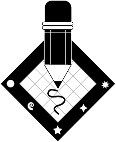
In lesson three we focused on using the shape tools like the rectangle, polygon, circle, and star tools. We also learned how to use the smart guides to line up certain objects and anchor them to eachother using reference points and the pencil tool to create the smooth pencil squiggle under the tip of the pencil. In addition, we learned how to change the stroke and fill color of an object.
Triangle Fish

It took many tools, patience, and long hours of strenuous work to complete this triangle fish. First, we used the polygon tool and changed the number of sides to 3 to make a triangle. We rotated the triangle 30 degrees and then copied it 7 times. We then made a line from the triangle all the way to the right of the page to the triangle all the way to the left of the page using the line segment tool. We then scaled the triangles and aranged them so that they would go in decending order from right to left resembling the body of a fish. Finally we colored the triangled using the fill tool and added an eyeball made out of different sized circles.
Harvest Festival Silent Auction Flyer
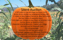
For my Harvest Festival Silent Auction flyer design I found a picture of a pumpkin patch using google and a picture of a pumpkin and layered them on top of eachother. I set the transparency of the pumpkin patch picture to around 50% to make the pumpkin stick out since I wanted the words to be on top of the pumpkin and the focus of the sign. I took the picture of the pumpkin repainted it with Paint, and then used photoshop to resize it, emboss it, and run it through filters to make it more cartoonish. I then used the text box tool to type out the words required to be on the sign. I placed the words and resized them so that they were in the basic shape of the pumpkin and did not trail off onto the picture of the pumpkin patch. I added a few minor details and came up with this simple, yet aesthetically pleasing flyer made in less than one class period.
Penny Social Flyer

For this project we made a Penny Social flyer for Mrs.Nassif and the Holy Name School. I decided to make it look like there were two pennies socializing and having a splendid glass of wine. I like the idea of this, but I didn't like how sloppy it came out. This was a rushed project because the first one I made got deleted so I had to remake one in about 5-10 minutes.
Flower

To make this flower appear three dimensional I took the flower symbol that was already in the symbol library on Adobe Illustrator and I used the pucker tool to twist and lift some of the petals and the embossing tool to add a shadow underneath the puckered flowers to make it seem as though some of the petals are lifted off the page! Simple tools can give a boring picture a life-like and 3D effect!
5 minute logo

My five minute logo was easily created in five minutes (hence the name) using a few easy tools. I used the symbol tool to create the leaf and lowered the thickness of the line pt. Then I used the text tool to create the two words "Garden" and "Cafe." I used two different texts to replicate the logo example used in the beginning of the lesson. Next I transformed and arranged "Garden" so that it was in the front of the piece and in front of "cafe" so that they overlap. Lastly, I colored the text and leaf using the fill tool, transformed and rotated the leaf twenty degrees and saved it to finish this simple design made in five minutes.
Pen tool
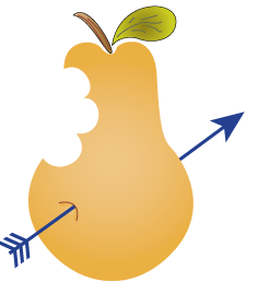
To make this pear we simply used the pen tool to create it's basic shape, stem and leave. Then we made the arrow using the line tool and added different arrow heads to the top and bottom. We colored the pear using preset gradients and finished it off by using the pencil tool to add some stripes and details to the leaf and stem.
Clipping mask

In this project we learned how to make a marble background and then apply it to letters using a clipping mask. We also got practice using the swirl, inner glow, and text tool.
15 Minute Business Card

Our next project was to make a business card in 15 minutes using a template on Adobe Illustrator. For this project we used some simple tools like the symbol sprayer, text box, and a few others. It was a very quick and easy project that showed us how to easily make a business card suitable for any company.
30 Minute Brochure
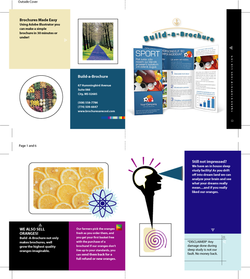
For our next class project we used a template on Adobe Illustrator to make a simple brochure for a fake company we made up. We experimented with color and placement of wording and pictures. This project gave us an easy way to make a professional pamphlet and it showed us how to make pick cohesive colors that would be appealing to customers.
Illustrator Fish
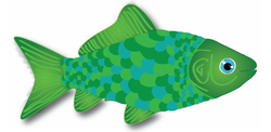
Our next mid-sized project in Advanced Graphics was to make a fish in Adobe Illustrator. We were given a template picture of a fish and asked to create our own version of it. We kept the basic shape of the fish but used the pencil tool to make our own eye, scales, fins, and any other accents. I chose a color scheme of blue and green and decided to make my scales switch between those colors. I then made my fins have a green gradient pattern to try to give them some excitment, and added stripes to show the texture of the actual fins. The final touches were the gils and adding an embossing style to the fins to make it appear as if the fish was swimming right off the paper. I like my final outcome but I feel as though I could have done a much better, detailed fish if I had more time. I was absent a lot during this week so I only had about 2 classes to finish.
